The user interface of a designed interactive product is the means in which the user and system interact through visual means due to a screen display. The user interface is not just about the visual appeal but presenting the user the input tools required to accomplish a task and achieve their goals. The user interface (UI) is the connection between the user and their experience and can have a lasting impression on the user either in a positive or negative way. The user interface is used to guide the user through the experience and the way that it is done is important as the experience needs to be easy to follow and engaging. The UI design is heavily dependent on the previous step in the design process which is the user scenario description where having a good knowledge of the user and how they interact with the device can determine the make or break of an interactive.
The user interface is the connection between the product and the user experience (UX). The User experience is about how the user enjoys using the website, app, kiosk etc and is determined by the interactive features and visual design of the interactive which is the UI. Ensuring a successful user experience is determined by the look, feel and usability of the interactive determined by navigation patterns consisting of Tabs, menus, carousels etc. Navigation is what is what determines how a user travels through an interactive and forms as part of the user interface so using the right navigational items to best work for the user, interactive and screen designs are essential.

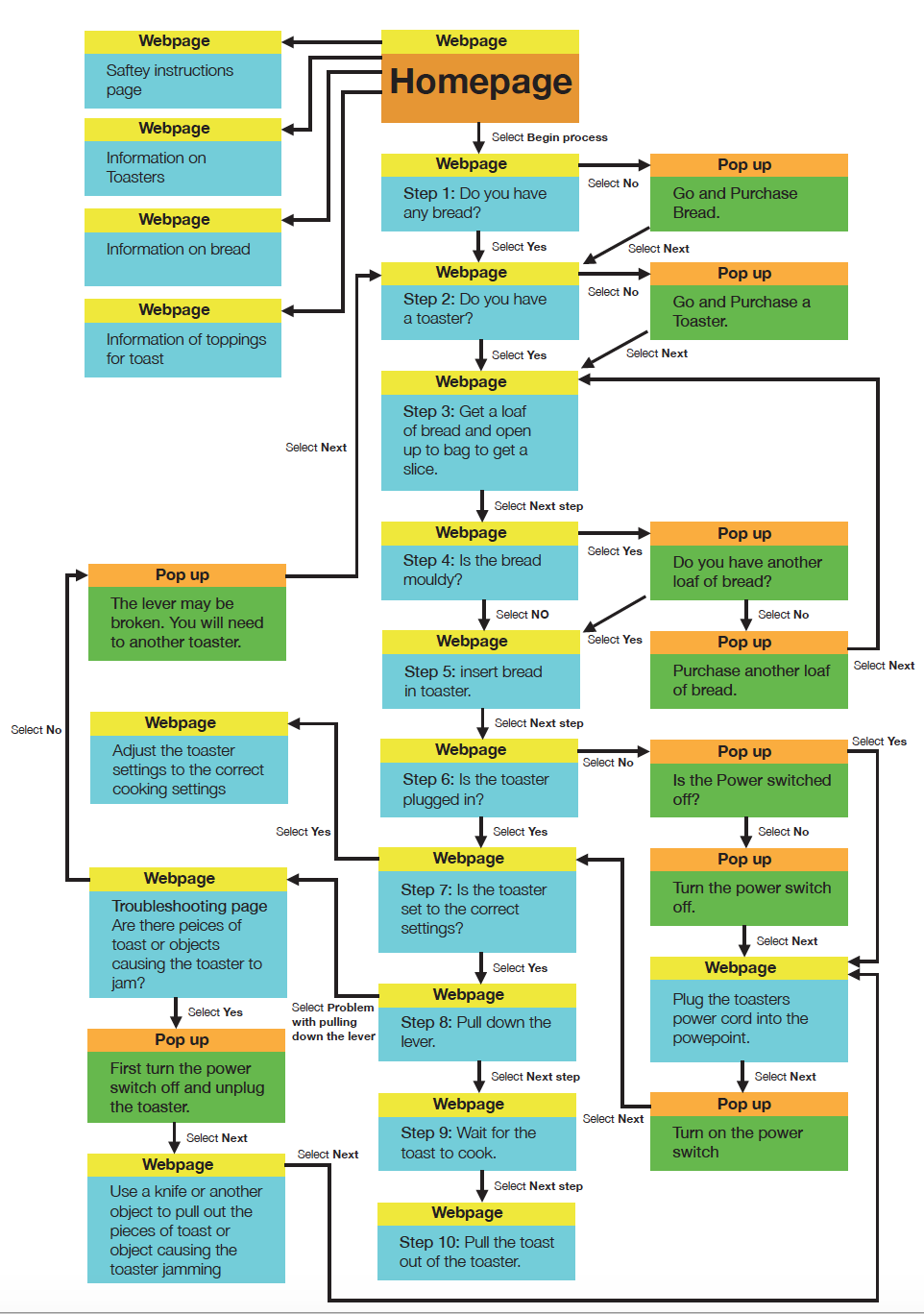
Figure 1: Waterson, S. (2019). [Image]. Retrieved from https://vimeo.com/319376545 
Figure 2: Waterson, S. (2019). [Image]. Retrieved from https://vimeo.com/319376545
Types of navigation
Tabs: Tabs are a commonly used navigation pattern and relate to the real world example of tabs used in a filing cabinet to make it easy to fined certain content and keep it organised. Tabs separate content into sections and used for a flat navigation structure providing the user with a clear indication of the content location with a labeled tab. Tabs are used on webpages when there is between 2 to 9 sections of content and is organised into tabs due to the site being unable to reveal all the content on the entire page.

Dropdown menu: A dropdown menu is used to save space, organise and hide information revealing the information with the user interacts with the menu by hovering over it, clicking or touching the dropdown menu. The menu is used to hold between 2 to 9 sections of information that require a hierarchical navigation structure.

Fly-out/Drawer menu: A fly-out/drawer menu is designed to save space and allow for quick access to all key menu items at once. This type of menu can also be used as a shortcut to certain information and pages and can be used to bypass the main user pathway set out to get to the end goal quicker.

Shortcut Dropdown: A shortcut dropdown consists of a search bar that allows for the user to activate a dropdown to access a specific section in a fast and easy way and does not involve hierarchy. It is usually used to provide a frequently used pathway that can be shortened for the user to get easy access to a specific page.

Big Footer: The big footer allows the user to quickly access specific sections of content in an interactive by allowing the user to bypass the main navigational system or structure set at the top. The footer provides shorter pathways for the user to access certain pages with different hierarchical levels.

Home button/Link: Every webpage must provide an easy access pathway back to the home page or menu no matter what part of the interactive the user is at or up to. The link to the home page or menu must be presented clearly to the user and must be provided on every page on the interactive. The home page link can be the interactives logo which is commonly used on branded websites at the top of the webpage that can be clicked on by the user. If an interactive doesn’t have a logo a clear button that is labeled ‘Home’ must be provided instead or as well as the logo. If there is more then one home page then there must be a distinctive link between the local and main home page.

Breadcrumbs: Breadcrumbs are used when the user needs to know their location in a websites hierarchical structure and provide the option for the user to travel back through the breadcrumbs. The breadcrumbs are used to inform the user their location throughout the entire sites hierarchy and a way to trace every step they have taken to get to the point they have arrived at in the site. This allows for the sites structure to be easily understood as it takes up minimal space and hint the structure and location of the pages. Breadcrumbs are used when the structure of the site is broken up into sections and divided into subsections which build up a sites complexity which can make the websites structure confusing. Breadcrumbs are used when the user has most likely arrived on a webpage that was provided by an external source. Breadcrumbs are used with other types of navigation and are never used as the main source of navigation it is recognised as a sub form of navigation.

Carousel: A carousel is used when the user needs to browse through a set of items and need to select a specific one. A carousel organised a large set of items to be shown and scrolled through similar to a slide show. The carousel allows the user to focus on only an item or a few items at a time and allow the user to know that there are more items available. It is used when there is not enough space to show all the items at once as the items displayed are only visual items that can be used to displayed products and posters etc.

Navigation is a critical part of designing a successful interactive product/system as navigation is the main use of interactivity that allows the user to explore content. Making sure the right navigation is used for certain features in an interactive is important for a successful interactive and that is all determined by the content, context and the type of user. Successful navigation is what makes up the user interface look and feel and the user experience an enjoyable experience for the user.


 Designing for Interactivity